Have you ever wondered how scientists and researchers organize and understand large amounts of data? They use a special tool called a histogram, which acts like a visual storyteller, helping us see patterns and trends hidden within numbers.
What is a Histogram?
Imagine a bunch of colorful candies scattered on a table. To organize them, we might sort them by color. Similarly, a histogram helps us organize numerical data by grouping similar values. These groups are called bins or intervals, and they represent a specific range of numbers.
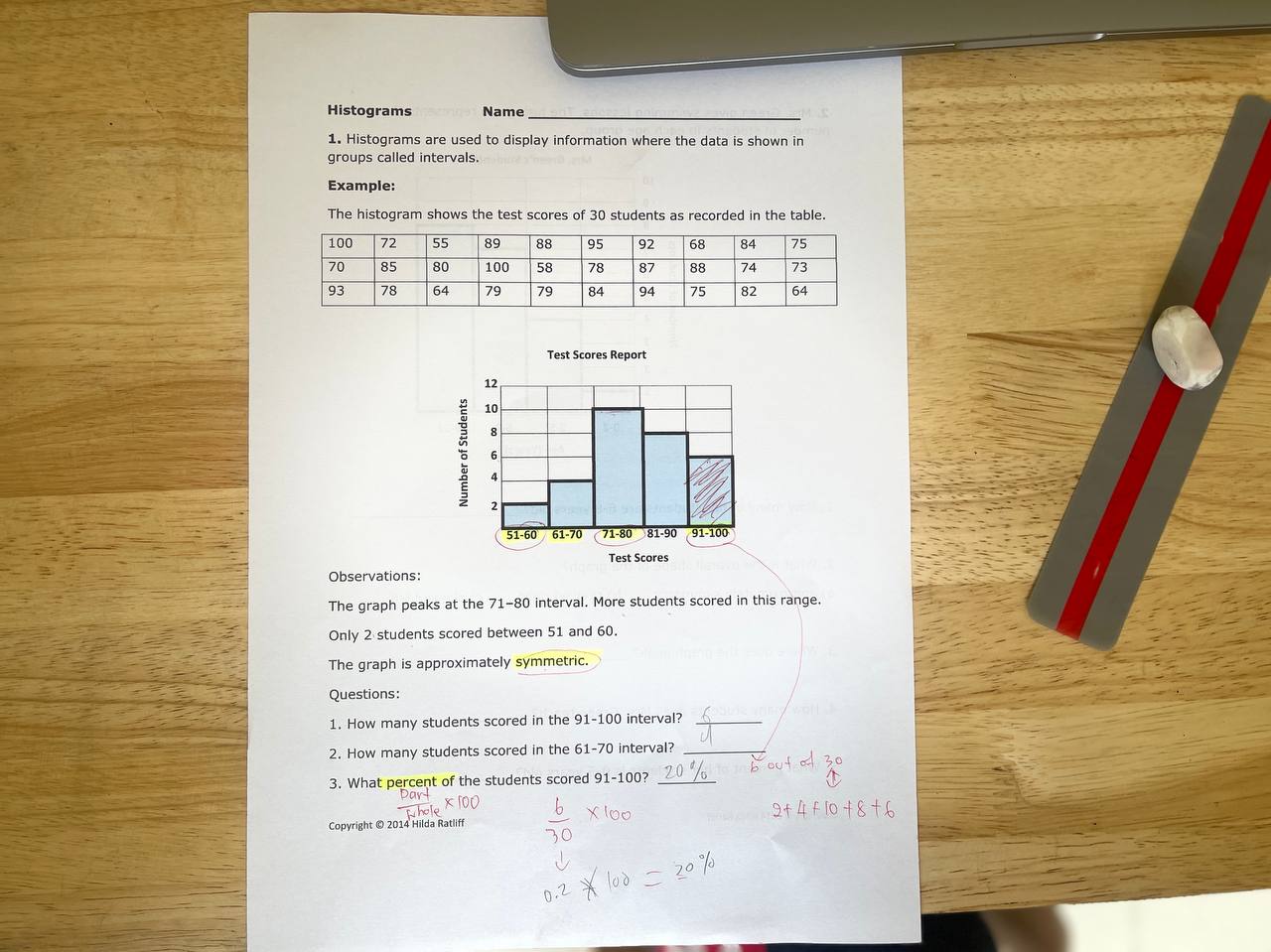
The x-axis of a histogram shows these bins, while the y-axis represents the frequency, or how many data points fall within each bin. Taller bars indicate more data points in that particular range, while shorter bars represent fewer data points.
Why Use Histograms?
Like bar charts, histograms use bars to represent data, but they excel at visualizing continuous data. This means the data points can theoretically fall anywhere within a specific range, unlike discrete data which has distinct categories (e.g., shoe sizes).
Histograms offer several advantages:
- Visualizing distribution: They help us see how the data is spread out, whether it’s clustered around a central value or more spread out.
- Identifying patterns: Histograms can reveal patterns like trends, central tendencies (like the average), and outliers (data points significantly different from the rest).
- Comparing data sets: We can use histograms to visually compare two or more sets of data, identifying similarities and differences in their distribution.
Making Your Own Histogram
Creating a histogram is a fun and engaging way to understand the concept. Here’s a simple activity to try:
Materials:
- Chart paper or graph paper
- Pencils, crayons, or markers
- Ruler
Steps:
- Gather data: Choose a set of numerical data, such as the heights of your classmates, the number of marbles each child in your class has, or the time it takes each student to complete a task.
- Organize the data: Order the data points from smallest to largest.
- Create bins: Decide on the number of bins (usually 5-10) and the range of values each bin will represent. Ensure the bins are of equal width.
- Count the frequencies: Count how many data points fall within each bin and record the frequency for each bin.
- Draw the histogram: Label the x-axis with the bin ranges and the y-axis with the frequency. Draw bars for each bin, with the height of each bar proportional to its frequency.
Exploring the World with Histograms
From analyzing weather patterns to understanding test scores, histograms have diverse applications. They are valuable tools in various fields, including science, economics, and even sports analytics. As you explore the world around you, keep an eye out for situations where histograms might be used to represent and analyze data.
By understanding the basics of histograms, young learners can embark on a journey of data exploration, unlocking the secrets hidden within numbers and gaining valuable insights into the world around them.


Leave A Comment